I recently completed a fantastic course in Domestika called “Data visualization and information design: Create a visual model” by Federica Fragapane. The course does a fantastic job of walking through each steps involved in the process of information design.
Even if I cannot remember everything from the course, the key takeaway for me was the concept of visual alphabets – visual language you use to convey your data and information. These could be color, shapes, proximity, shapes, sizes and so on.
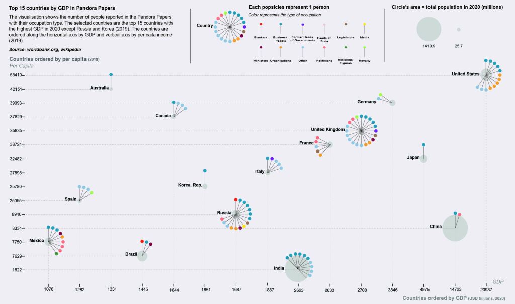
The below viz is an inspiration from the viz used in the course. Around the same time, the pandora papers published the several elites using offshore accounts to hide their wealth. This got me excited and I decided to use the data for this project.
I wanted to use a different tool, Adobe Illustrator and therefore, I had to get acquainted with the tool. For this, I followed an excellent free youtube tutorial.
Data Source: Worldbank.org, Wikipedia
You can view and download the data source file from my git repo here.

Leave a comment